
Pantone's Colour of 2022
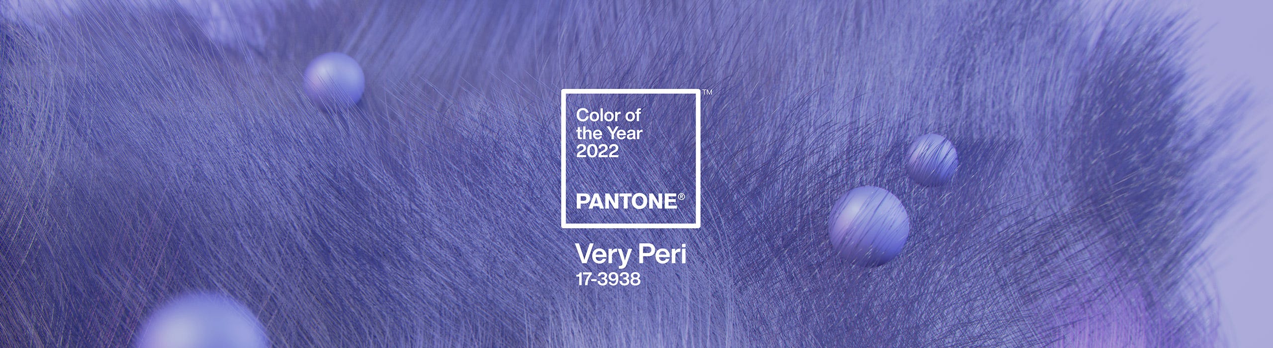
Pantone have announced their colour of 2022… and the winner is…
Very Peri!
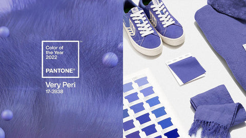
Image from Pantone.
The American colour company endorses a shade every year which it believes will be particularly widely used in the year to come. This year marks the first time a colour has been created specifically for Pantone’s colour of the year designation.
Pantone says Very Peri is the “happiest and warmest of all the blue hues” because it “blends the faithfulness and constancy of blue with the energy and excitement of red”.
“As we move into a world of unprecedented change, the selection of Pantone 17-3938 Very Peri brings a novel perspective and vision of the trusted and beloved blue colour family,” says Pantone Color Institute exec director Leatrice Eiseman.
The aim behind the colour of the year process is to influence the wider design world, from interiors to industrial design.
For interiors, Pantone says Very Peri is capable of “injecting a sense of playful freshness” into homes and spaces – particularly through “unusual” combinations. They say applying it to different textures and finishes will exaggerate this.
Pantone have suggested some colour palettes and harmonies to demonstrate its versatility:
Balancing Act
Wellspring
The Star of the Show
Amusements
I wanted to see if we could recreate the first colour harmony in the Balancing Act palette using paints available at Shabby Nook. Here is what is looks like:

First - we need a dupe for Very Peri!
Very Peri may be a new colour created by Pantone but you can mix your own version using Dixie Belle Chalk Paints! If you mix 1 part Blueberry with 1 part Amethyst you get Royal Night which is a very similar hue to Very Peri. The best thing about mixing your own colour is you get control over it - if you want it a bit more purply, just add more Amethyst, if you prefer a blue hue, add more Blueberry!

Next the mauvy colour.
Again, this would be one for a custom mix but this time using Fusion Mineral Paint. Mix 1 part Liberty Blue and 2 parts Fort York Red with 3 parts Picket Fence. If you’d like it a bit lighter add some more Picket Fence.

.
The final two colours are easier, no mixing involved! I think Tea Rose and Putty from Dixie Belle's Chalk Paint range are a great match for the pink and yellow taupe hues!

-
Posted in
blog


Please upload banner from store admin blog pages